Tag Archives: statistics

AAST 2019 #4: Kidney Injury And The “Random Forest Model”

Brace yourselves, this one is going to be intense! I selected the next paper due to its use of an unusual modeling technique, the random forest model (RFM). What, you say, is that? Exactly!

The RFM is a relatively new method (5 years old for trauma stuff) that uses artificial intelligence (AI) to try to tease out relationships in data. It is different from its better known cousin, the neural network. The RFM tries to strike a balance of flexibility so that it can deduce rules from data sets that may not otherwise be apparent.

The authors from the trauma program at Emory in Atlanta wanted to develop a predictive model to identify factors leading to acute kidney injury in trauma patients. They assembled a small data set from 145 patients culled over a four year period. Some esoteric lab tests were collected on these patients (including serum vascular endothelial growth factor and serum monocyte chemoattractant protein-1), the sequential organ failure assess score (SOFA) was calculated, and then all was fed to the machine learning system.

The authors go into some detail about how they accomplished this work.  The main results are the sensitivity and specificity of both the RFM analysis. The RFM numbers were also converted to a regression equation and similarly examined. The area under the receiver operating characteristic curve (AUROC) was calculated for both.

Here are the factoids when using SOFA and the two biomarkers above:

  • For RFM: sensitivity .82, specificity .61, AUROC 0.74
  • For the resulting logistic regression: sens 0.77, spec 0.64, AUROC 0.72

The authors conclude that the biomarkers “may have diagnostic utility” in the early identification of patients who go on to develop AKI and that “further refinement and validation” could be helpful.

I’ll say! First, RFM is a very esoteric analysis tool, especially in the trauma world. Typically, it’s strengths are the following:

  • Requires few statistical assumptions like normal distribution
  • Allows the use of lower quality models to come up with a result
  • Shows the relative importance of each prediction feature, unlike the opacity of neural networks

The downsides?

  • It’s complicated
  • Doesn’t do well with data outside the ranges found in the dataset
  • May be difficult to interpret

But the real problem here is with the results. At this point, they are weak at best. The algorithm predicts only 4 of 5 actual cases of AKI correctly and identifies barely more than half of patients who don’t. Coin toss. A good AUROC number is better than 0.8. The ones obtained here are fair to poor at best.

I understand that this is probably a pilot study. But it seems unlikely that adding more data points will help, especially if the same input parameters are to be used in the future. I think this is an interesting exercise, but I need help seeing any future clinical applicability!

Here are my questions for the presenter and authors:

  • Why did it occur to you to try this technique? Who thought to use it? Your statisticians? What was the rationale, aside from not being able to collect any more data for the study? The origin study should be very interesting!
  • Given the lackluster results, how are you planning to “refine and validate” to make them better?
  • What future do you see for using RFM in other trauma-related studies?

I’m intrigued! Can’t wait to hear the punch lines!

Reference: Random forest model predicts acute kidney injury after trauma laparotomy. AAST Oral Abstract #11.

A Cool Way To Look At Injury Data

Governmental agencies everywhere collect trauma related data. The US federal government maintains a number of databases, such as the Fatal Accident Reporting System (FARS), the Census of Fatal Occupational Injuries (CFOI) and many others. States collect similar but smaller datasets. Even towns and municipalities collate injury information in the form of prehospital run sheets.

But reams of data are of no use unless you can learn something from it. Unfortunately, most of this data is tucked away in database management systems, or in some cases just stacks of paper forms locked up somewhere. In order for humans to make sense of it and do useful things with it, we need to transform it into forms that we can easily interpret and make sense of. 

Fortunately, there are lots of visual, electronic tools available to help us do just that. One of the most helpful tools is the programmable geographic information system (GIS). An example of this is Google Maps. Most of us have used this or a similar tool in some form, usually to get directions from here to there. But you may not be aware that Google provides a programming interface so a savvy user can place any type of geography-related data on the map, creating what is called a mashup.

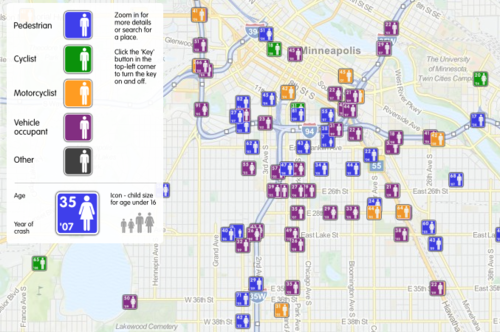
Imagine crossing the FARS database, which contains extensive data points on every fatal road accident in the US, with a mapping system. This would allow creation of a map showing where every person lost their life in a road accident, along with additional pertinent information about the event. A great example of this is demonstrated below. It was created by ITO World Ltd., based in the UK. They crossed fatality information with geographic map data in both the US and the UK.

image

This map shows fatal road events around Minneapolis from 2001 to 2009. The type of event (pedestrian struck, motor vehicle crash, etc.) is displayed along with age, year and sex. It is movable and zoomable so it can be viewed it in great detail. Click on the map above to open a new window to the full map.

Bottom line: Using trauma data / map mashups is a great way to visualize complex information. It also allows us to plan meaningful prevention activities based on local information (a requirement for ACS trauma center verification). Imagine looking over such a map of your city, and identifying a cluster of pedestrian fatalities. Then you notice that this cluster is 2 blocks away from an elementary school. This could prompt you to work with the school to implement automobile awareness programs for the children, have the city review signage and obstructions to view in the area, and optimize the number and placement of crossing guards. Then redo the map afterwards to judge the impact. Wow!

Website: http://map.itoworld.com/road-casualties-usa#fullscreen 

Reference: Using geographic information systems in injury research. J Nurs Scholarsh 39(4):306-311, 2007.

A Cool Way To Look At Injury Data

Governmental agencies everywhere collect trauma related data. The US federal government maintains a number of databases, such as the Fatal Accident Reporting System (FARS), the Census of Fatal Occupational Injuries (CFOI) and many others. States collect similar but smaller datasets. Even towns and municipalities collate injury information in the form of prehospital run sheets.

But reams of data are of no use unless you can learn something from it. Unfortunately, most of this data is tucked away in database management systems, or in some cases just stacks of paper forms locked up somewhere. In order for humans to make sense of it and do useful things with it, we need to transform it into forms that we can easily interpret and make sense of. 

Fortunately, there are lots of visual, electronic tools available to help us do just that. One of the most helpful tools is the programmable geographic information system (GIS). An example of this is Google Maps. Most of us have used this or a similar tool in some form, usually to get directions from here to there. But you may not be aware that Google provides a programming interface so a savvy user can place any type of geography-related data on the map, creating what is called a mashup.

Imagine crossing the FARS database, which contains extensive data points on every fatal road accident in the US, with a mapping system. This would allow creation of a map showing where every person lost their life in a road accident, along with additional pertinent information about the event. A great example of this is demonstrated below. It was created by ITO World Ltd., based in the UK. They crossed fatality information with geographic map data in both the US and the UK.

This map shows fatal road events around Minneapolis from 2001 to 2009. The type of event (pedestrian struck, motor vehicle crash, etc.) is displayed along with age, year and sex. It is movable and zoomable so it can be viewed it in great detail. Click on the map above to open a new window to the full map.

Bottom line: Using trauma data / map mashups is a great way to visualize complex information. It also allows us to plan meaningful prevention activities based on local information (a requirement for ACS trauma center verification). Imagine looking over such a map of your city, and identifying a cluster of pedestrian fatalities. Then you notice that this cluster is 2 blocks away from an elementary school. This could prompt you to work with the school to implement automobile awareness programs for the children, have the city review signage and obstructions to view in the area, and optimize the number and placement of crossing guards. Then redo the map afterwards to judge the impact. Wow!

Website: http://map.itoworld.com/road-casualties-usa#fullscreen 

Reference: Using geographic information systems in injury research. J Nurs Scholarsh 39(4):306-311, 2007.

Trauma Is The Leading Cause of Death …

We read this phrase all the time, in the newspapers and in many journal articles relating to trauma. Where do they get this? Well, it comes from mortality statistics compiled by the Center for Disease Control.

Trauma IS the leading cause of death in ages 1-44. In infants, congenital defects cause the most deaths and trauma is only #4. At age 45 and above, it begins to drop off, but stays in the top 5 until age 65 when it drops to #9. Overall, trauma is the #5 killer for all age groups combined.

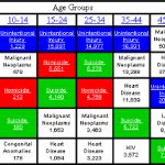
This image shows the top 5 causes of death across all age groups. The blue boxes are unintentional trauma, the red boxes are homicide, and the green boxes are suicide.

One fact that tends to surprise people is that suicide is such a common cause of death. Suicides are not typically reported in the news, so most people are unaware unless it involves their family or friends.