Category Archives: General

A Cool Way To Look At Injury Data

Governmental agencies everywhere collect trauma related data. The US federal government maintains a number of databases, such as the Fatal Accident Reporting System (FARS), the Census of Fatal Occupational Injuries (CFOI) and many others. States collect similar but smaller datasets. Even towns and municipalities collate injury information in the form of prehospital run sheets.

But reams of data are of no use unless you can learn something from it. Unfortunately, most of this data is tucked away in database management systems, or in some cases just stacks of paper forms locked up somewhere. In order for humans to make sense of it and do useful things with it, we need to transform it into forms that we can easily interpret and make sense of. 

Fortunately, there are lots of visual, electronic tools available to help us do just that. One of the most helpful tools is the programmable geographic information system (GIS). An example of this is Google Maps. Most of us have used this or a similar tool in some form, usually to get directions from here to there. But you may not be aware that Google provides a programming interface so a savvy user can place any type of geography-related data on the map, creating what is called a mashup.

Imagine crossing the FARS database, which contains extensive data points on every fatal road accident in the US, with a mapping system. This would allow creation of a map showing where every person lost their life in a road accident, along with additional pertinent information about the event. A great example of this is demonstrated below. It was created by ITO World Ltd., based in the UK. They crossed fatality information with geographic map data in both the US and the UK.

image

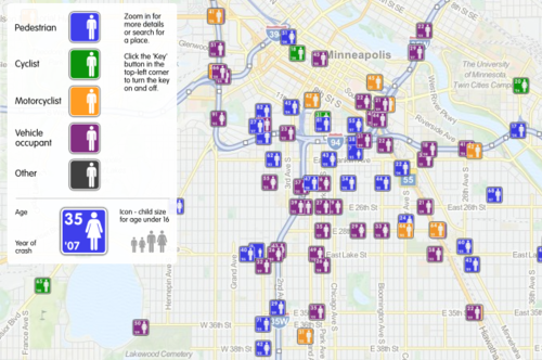
This map shows fatal road events around Minneapolis from 2001 to 2009. The type of event (pedestrian struck, motor vehicle crash, etc.) is displayed along with age, year and sex. It is movable and zoomable so it can be viewed it in great detail. Click on the map above to open a new window to the full map.

Bottom line: Using trauma data / map mashups is a great way to visualize complex information. It also allows us to plan meaningful prevention activities based on local information (a requirement for ACS trauma center verification). Imagine looking over such a map of your city, and identifying a cluster of pedestrian fatalities. Then you notice that this cluster is 2 blocks away from an elementary school. This could prompt you to work with the school to implement automobile awareness programs for the children, have the city review signage and obstructions to view in the area, and optimize the number and placement of crossing guards. Then redo the map afterwards to judge the impact. Wow!

Website: http://map.itoworld.com/road-casualties-usa#fullscreen 

Reference: Using geographic information systems in injury research. J Nurs Scholarsh 39(4):306-311, 2007.

New Technology: The Bruise Suit

Here’s an interesting new product. It’s called the “bruise suit”, and it was designed by some students at the Imperial College of London. The purpose of the suit is to visually indicate that enough force has been applied to potentially cause injuries.

image

It was initially designed to help Paralympic athletes detect when they’ve encountered enough force to cause injuries that they are unable to feel. It uses a pressure-sensitive industrial film developed by Fuji that changes color based on the compressive force applied. It gets darker as the force increases. 

This product is currently in the concept phase, meaning that it will be some time before it hits the market. However, it’s a great idea that has implications for athletes playing contact sports and rescue professionals, to name a few. We’ll see how it develops!

Traveling!

I’m currently in Montreal, and just finished some presentations at McGill University / Montreal General Hospital on pediatric trauma. I’ll be wandering around the city today and will finish the stab to the back case tomorrow. Looking for fans!

Knife To The Back! Part 3

So yesterday, we found that our patient was hemodynamically stable, with a knife in his back, positioned prone. An initial chest xray shows the knife (plainly) and haze in the right side of the chest. Obviously, this is a hemothorax. 

Key points to note are that the amount of blood present is modest and the knife point is relatively medial, as is the entry seen on the outside. Combined, these data points indicate that you have time to gather more information.

My choice was to go to CT to get the ultimate anatomic information. What, you say, the patient is prone! Well, the scanner doesn’t care. As long has his torso AND the knife fit through, it works. Here’s the representative scan result:

What do you do now? Where do you do it? Answer tomorrow. Tweet or comment your decision!

Related posts:

Knife To The Back! Part 2

Yesterday, I presented a case of a young man with a knife in his back. He was brought to your ED in the prone position. The question was, what to do next?

With any trauma patient, regardless of size, shape, or position, the first question is always, “does this patient belong in the ED?” And usually, that question is answered by checking hemodynamic stability.

This patient stays prone while you quickly assess vital signs. If vitals are abnormal, he needs to get rolled to the operating room immediately, while still prone. There is no time to figure out how to reposition, or if the knife can be removed. Get him out of your ED.

But let’s say he is hemodynamically normal and talking to you. You need more information. So start with a physical exam. With him in the prone position! It works. In this case, there are no other puncture wounds, and the anterior part of the body can be examined by carefully logrolling him onto his side. Breath sounds are decreased over the right chest, otherwise there are no other anomalies.

So now what? Well, let’s get some more info! How about a chest xray? Best position? Prone! It’s the easiest, because the patient does not need to be held up next to an xray plate, which would also have to be held manually. The lateral view doesn’t add anything but hassle. Here’s the result:

Now what? What do you see, what do you do? Tweet or comment; more to follow tomorrow.

Related post: